Thursday, 23 July 2009

Is swine flu really all that bad?

Now I am not denying the fact that there is a nasty novel variant of type A H1N1 influenza out there. And that it has an interesting and rather nasty set of symptoms to it. But a good comparison to be looking at is how it compares to the seasonal flu statistics from previous years.

And this is exactly what happens in part of this article in the Otago Daily Times (ODT - my local paper). Mostly the article was about how with the University semester starting last week and many students coming back into town there has been a surge in the number of cases suspected, especially at the University's student health centre. It reports that there are (have been?) 2443 confirmed cases nationwide (as of Tuesday), which was up 80 from the day before, with 26 in intensive care and 11 deaths.

The comparison comes at the end of the article, where it states that the total number of influenza-related deaths (for all subtypes) so far this season (April - end of June) was 109, and this compares to 479 deaths for the last year for which the Ministry of Health had released figures, 2006. So with seasonal flu being a winter months phenomenon then we expect that most of the cases occur between April and maybe October (the winter months for us in the southern hemisphere - ok here I have included most of autumn and the start of spring).

What this suggests, at least at first glance is that this has been a quiet year so far for seasonal flu although this years numbers do not include the coldest month of July. And further more that swine flu has not been a major factor in influenza deaths so far.

So while there may be lots of cases (especially suspected cases - if the anecdotes I hear from friends and family are to be believed), this flu certainly here in NZ does not seem to be much to worry about. Especially in comparison to previous flu pandemics such as 1918. This of course could be some what due to the reaction of bodies like WHO and the local health authorities and their publicity/education campaigns about how to prevent the spread of the disease.

Though it is interesting to note that the North American region is having a lot of cases out of flu season. I guess we will all have to wait and see what happens.
Continue Reading...

Monday, 20 July 2009

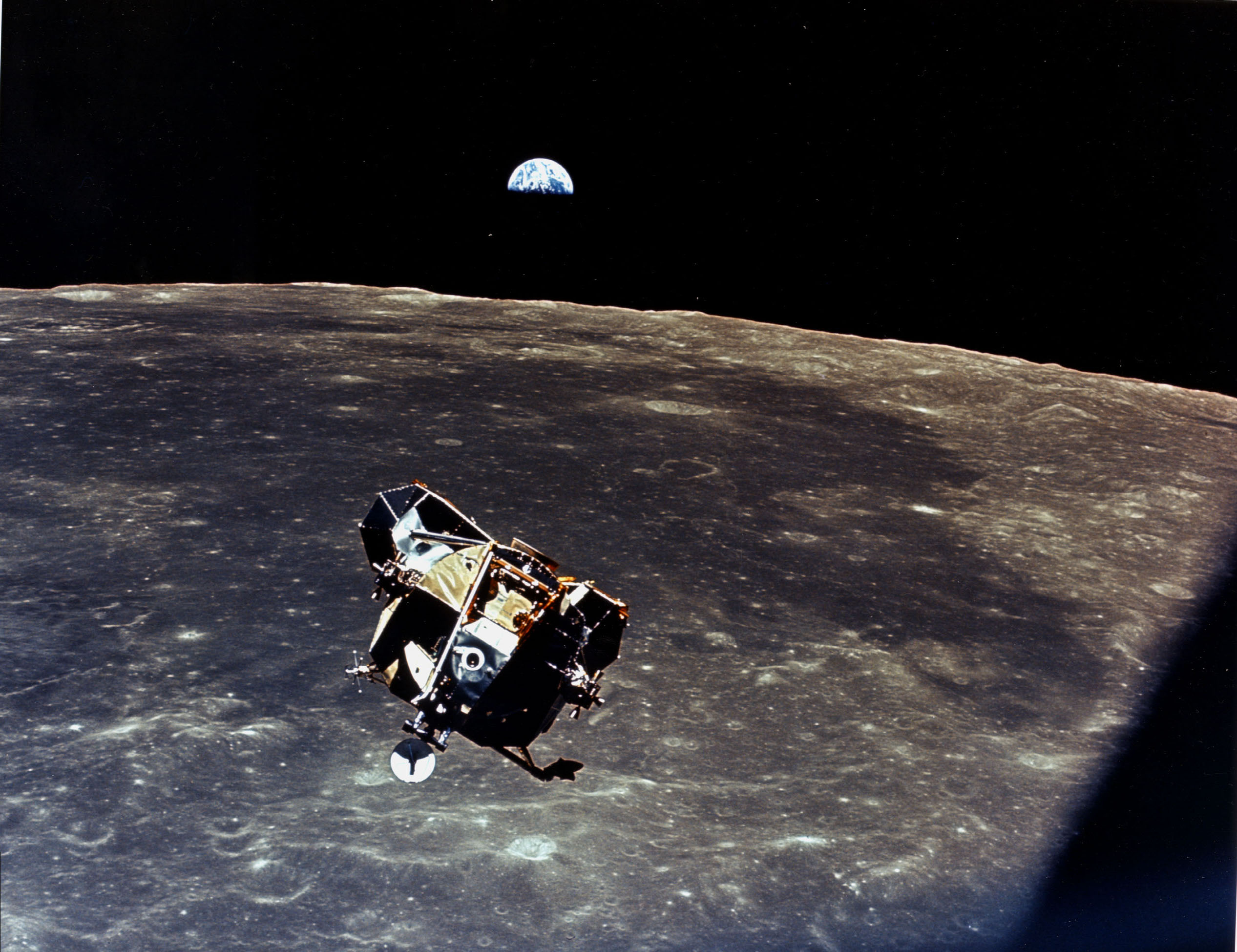
A funny thing happened on the way back from the Moon

40 years ago tomorrow Micheal Collins in the Command Module Columbia snapped this pic of the ascent stage of the Lunar Module Eagle as they returned from the surface of the moon.

And in the couple of years following this 10 more men walked on the surface of our planet's orbital buddy, following in the historic footsteps of Armstrong and Aldrin (40 years ago today- so I will wish Tranquility Base happy 40th birthday).

Unfortunately to this day some people do not believe, for various reasons, that we never set foot on the moon (for example see here).

But one of the results of this walking/driving on our natural satelite is that we left an awful mess behind us. Descent stages of the lunar landers, flags, rovers, scientific equipment, footprints, the list goes on. One of the denier arguments goes along the lines of well if this stuff is there why can't we see it. The answer to which is that it is too small.

That is until now. Recent photos taken by the Lunar Reconnaissance Orbiter (LRO), which entered orbit around the moon in the last few weeks has a camera with enough resolution to quite clearly see that which we left behind. Many more details can be found here on the NASA site. These photos are awesome, I mean just look at this:
You can even make out the path the astronauts took to set up the scientific experiments that they left behind. And the good news is that these photos were not taken at the final mapping orbit of the satellite and hence are not at the fullest resolution that the onboard camera will be able to see. So keep a look out there will be more and better photos of these sites as the LRO mission continues.

Thanks to Starts With A Bang and Astronomy Picture of the Day for the links

Update: oops got my dates wrong again - for some reason the 19th always sticks in my head but the lunar landing happened on the 20th.

Continue Reading...

Friday, 3 July 2009

Cosmic Rays, Clouds and Climate

For some reason I am still not sure of I ended up this afternoon on the wordpress homepage and one of the featured blogs was last year's weblog award winner for best science blog What's Up With That (WUWT).

If you have never come across this blog before, and I have only ever heard about it in passing, they are of some what of a climate change denialist point of view (which as Phil mentions in that last link just shows that all the webbies are is a popularity contest rather than an evidence based award). The post that was front and centre on the blog was this one about the relationship between cosmic rays and cloud formation. What really caught my attention was the juxtaposition between the "headline": Message in the CLOUD for Warmists: The end is near?, and the graph that followed the first paragraph.

Now the paragraph (and actually the graph) talk about the correlation between cosmic rays (using various isotopes as a proxy) and temperature. Much of the rest of the post is a quite interesting description of the CERN experiments and hypothesis that links the galactic cosmic rays (GCR) and cloud formation, and while that is all interesting it is irrelevant to what I wanted to say, even if this turns out to be correct.

Now if you look closely at the graph you can see that it covers the last almost 800 years and the proxies for the GCR (10Be and 14C which are the blue and black lines) correlate very well with the red line (Siberian Temperature). They track each other quite well through the dark ages and into the medieval warm period and even through the maunder minimum (little ice age) right up until the middle of the 19th century. Now once we get to the late 19th century we see that the temperature continues to rise and the other lines level off a bit - you can still see that there is a slight influence with the dip in temperature around early to mid 20th century but the lines in general are no longer closely correlated.

Oops! Maybe if you are going to make an argument you should make sure that your strongest piece of evidence does not plainly and in clear sight contradict your argument.

What does that all mean, firstly well it looks remarkably like the temperature and sunspot cycle length plot I showed previously and as I stated in that post what we can see is an excellent correlation spoiled since the industrial revolution. I left a comment on the WUWT blog that outlined the above lack of modern correlation and stated that what has happened since the industrial revolution that we know may have caused this warming, well we have been putting out a lot of CO2.

Other commenters on the WUWT blog mention that CO2 is a very minor atmospheric constituent and that H2O is a better green house gas and much more prevalent. Well this is also true, however H2O has some rather interesting behaviors it saturates quite easily in the atmosphere and everyone that does not live in desert (or at least a drought) gets to experience this - RAIN! Also if you have ever been to the tropics, you may have noticed that the rain can be quite heavy when it is warm this is because increasing the temperature allows the atmosphere to hold more water.

If water vapor itself was enough to trigger the sort of greenhouse effect that we are seeing then we would have long ago passed the point of now return, but fortunately the saturation of water in the atmosphere (what we call 100% relative humidity) seems to prevent this from happening - although this is not to say that when the temperature does get warm that there will be more water in the atmosphere which will probably on lead to worse storms etc rather than any large feedback effect (which means I had to write a retraction since I claimed that there may have been an H2O feedback in my original comment on WUWT - ooops gotta think the consequences through more).

Continue Reading...

Bad experiment design

Here in New Zealand we tend to import big important current affairs shows such as 20/20 and 60 Minutes, of course we put our own host upfront and show a couple of local stories as well as the interesting ones, mostly from the US, that seem to come with the program.

Well on Monday, during 60 Minutes they had a discussion (and this was one of the local stories) about food coloring and children's behaviour (the video clip of the story at the link). They talked with the experts and afflicted parents about how food coloring is bad and is being phased out in places and why are we not doing it etc. This in and of itself is reasonable and studies have shown that coloring can lead to hyperactivity in (some) children

But the really bad part of this was when they set up an experiment to show just what effect that the colorings have. They got some parents to lend their children (the kids all looked to be around 6-10 maybe) to the demonstration and put them in two groups. One group would have a healthy color free afternoon tea and the other group would have an afternoon tea full of colorings. They tested the children by getting them to do a drawing and some writing both before and after the food, and the children with the color free food had very little change in their drawing/writing while those in the color group there was a marked decrease in competency. However the best illustration (as far as the producers and the anti-color people were concerned) was that the kids in the color group were just bouncing off the walls and in one case bouncing balls of the presenter and interviewee (a child psychologist I think).

On the face of it this sounds like a great demonstration that showed up exactly the concerns that exist about the colorings. The problem was in the controlling of the coloring/non-coloring foods. The coloring group got all the foods that you can give to kids with heaps of the bad colorings in them, things like candy, cordial drinks and coke and that sort of thing. The non-colorings group had lots of fresh fruit and water.

If you have not spotted why this does not show colorings in a bad light then maybe go back and compare those snacks again. The colorings group not only got colorings that the non-colorings group did not get but they also got lots of high sugar food (especially refined sugars) and caffeine that the control group did not get, for those of you at home these are known as confounding factors.

So what did the demonstration show, that a combination of lots of sugar, caffeine and coloring leads to kids bouncing off the walls. Last time I checked with my two little boys (and their friends) that amount of sugar alone will set kids off, as I witnessed at my elder boy's 4th birthday party last weekend.

How could they have done this better, well clearly the control group should have had the same amount and type of sugars, that way you would have been able to see the effect of the colorings, rather than what I suspect was mainly the effect of the sugar that these kids got to stuff themselves with. An example of a way that this could have been done was to use cordial drinks alone as the difference between the groups as many brands put out a color-free variety as well as the usual colored ones.

Unfortunately, my wife tells me that some of the other mothers at the playcentre my children go to, did not manage to see this fault in the demonstration and my wife was not able to convince them of why it did not show what they said it showed.

That all said, there does appear to be something to this hypothesis that food colorings can be bad for children's behavior - now if only we could get the TV people to realise how to design a demonstration to illustrate a point. Oh well I had better send them a copy of this.

Update: added link to clip from show.

Continue Reading...